

Share this:
Facebook
Twitter
LinkedIn
The Artemis Global Brand Identity
—
Brand identity | Marketing materials | Print Design
Artemis Global Group is an international business consultancy with a focus on helping businesses and people push boundaries and hunt success across a wide variety of sectors. We were asked to help develop the brand identity and marketing materials for the company launch.

The brief
—
TAGG’s ideology is based around the premise of clients being on a global hunt, one that is never ending in an attempt to improve themselves in mind and body, resulting in better personal and professional performance, and fulfilment in leading extraordinary lives. The client wanted to use this ideology as the basis for the branding brief.
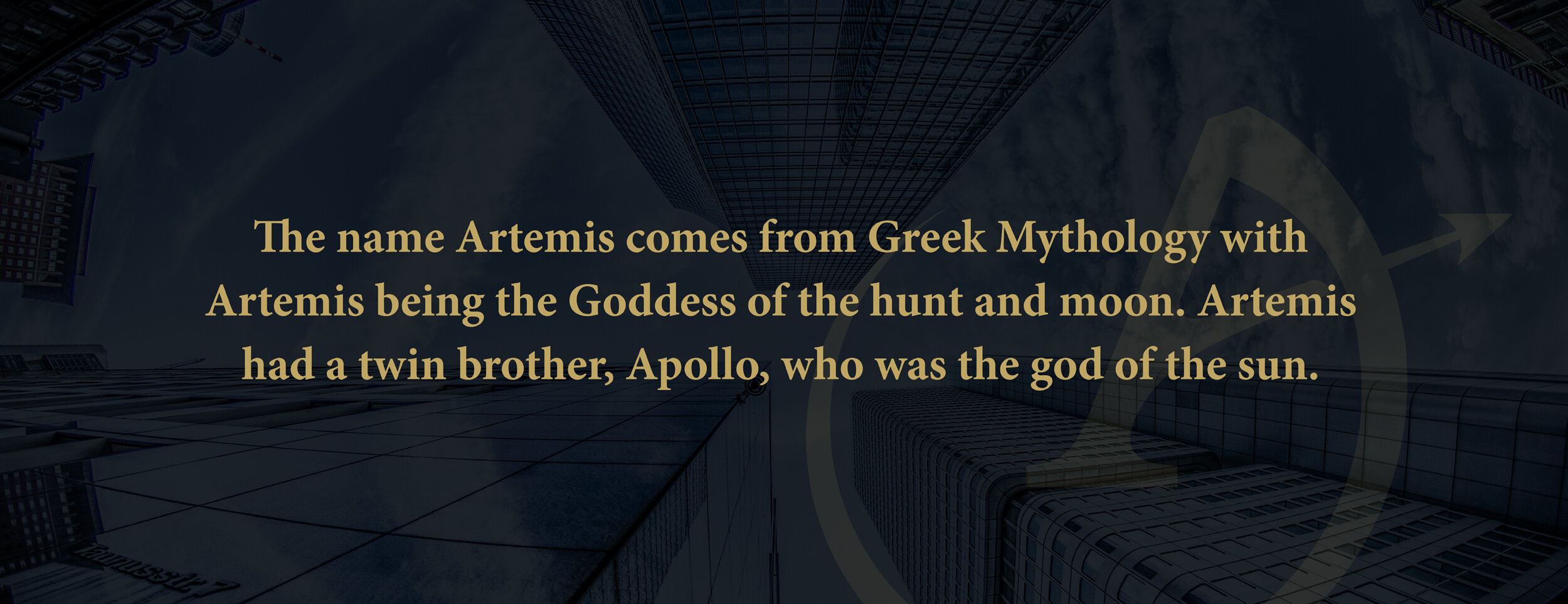
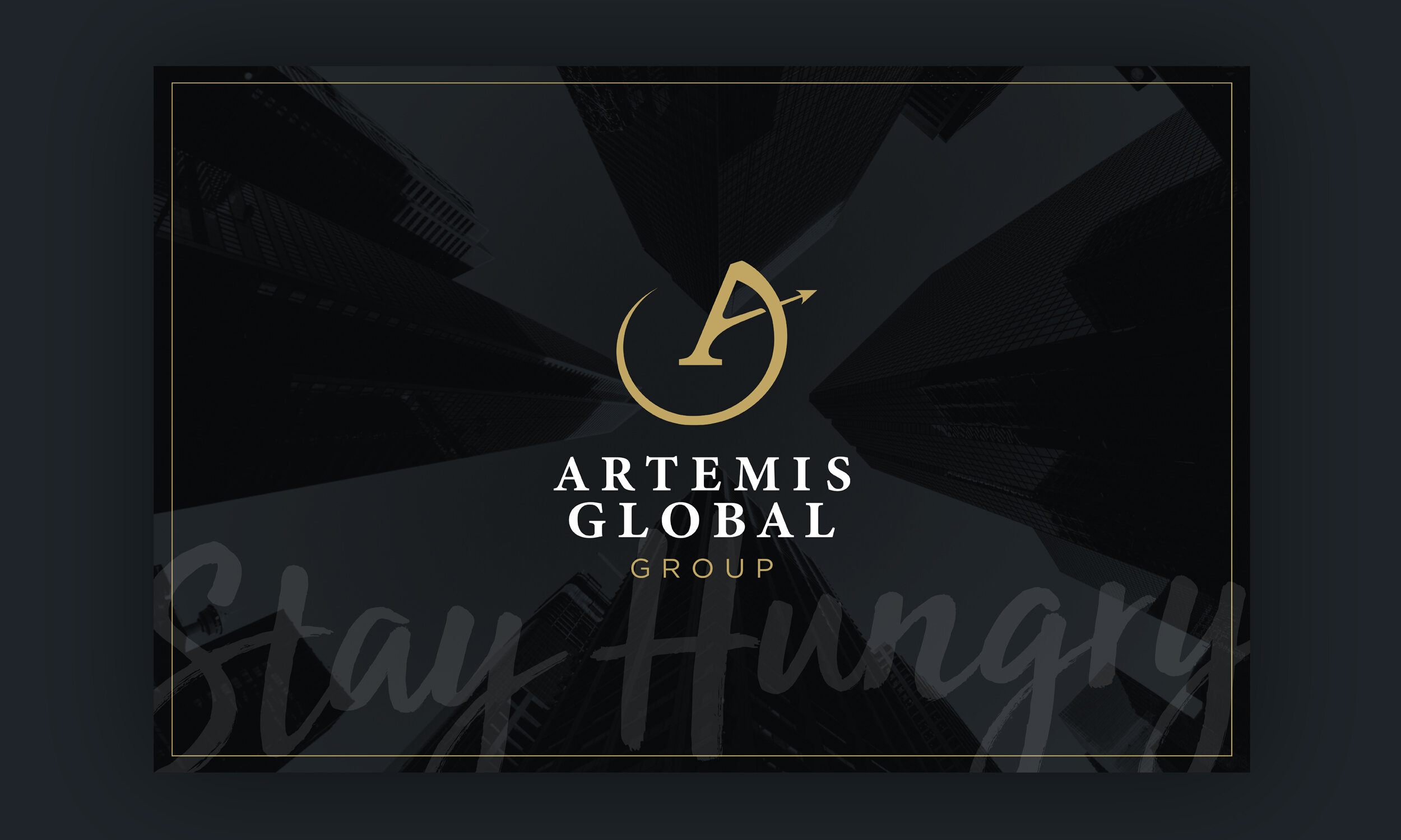
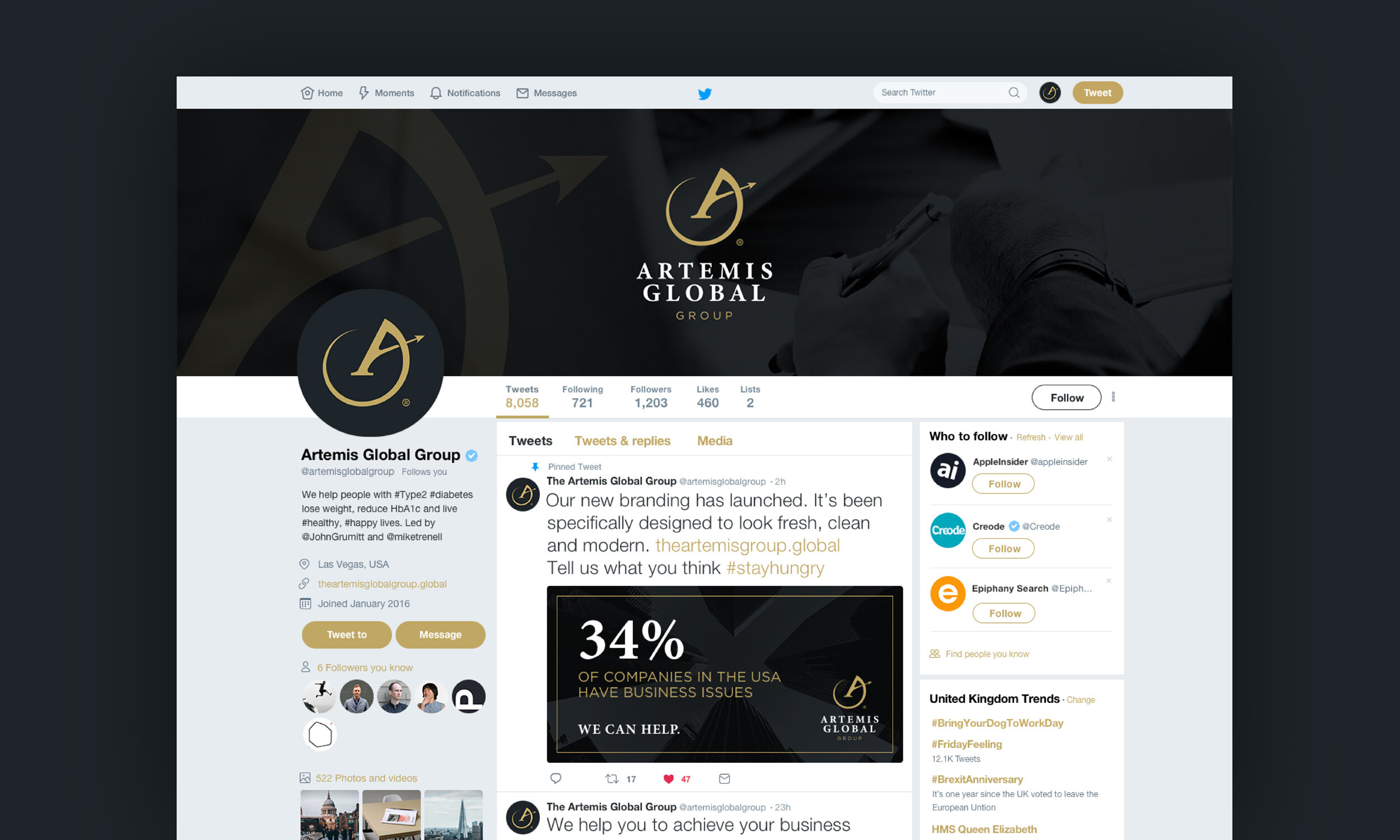
In addition, they wanted a brand identity to exemplify their “Stay Hungry” message and the mythology behind their name, which was inspired by Artemis, the Greek goddess of the hunt, wild animals and the moon. At the same time, it needed to have a professional, corporate vibe.

The solution
—
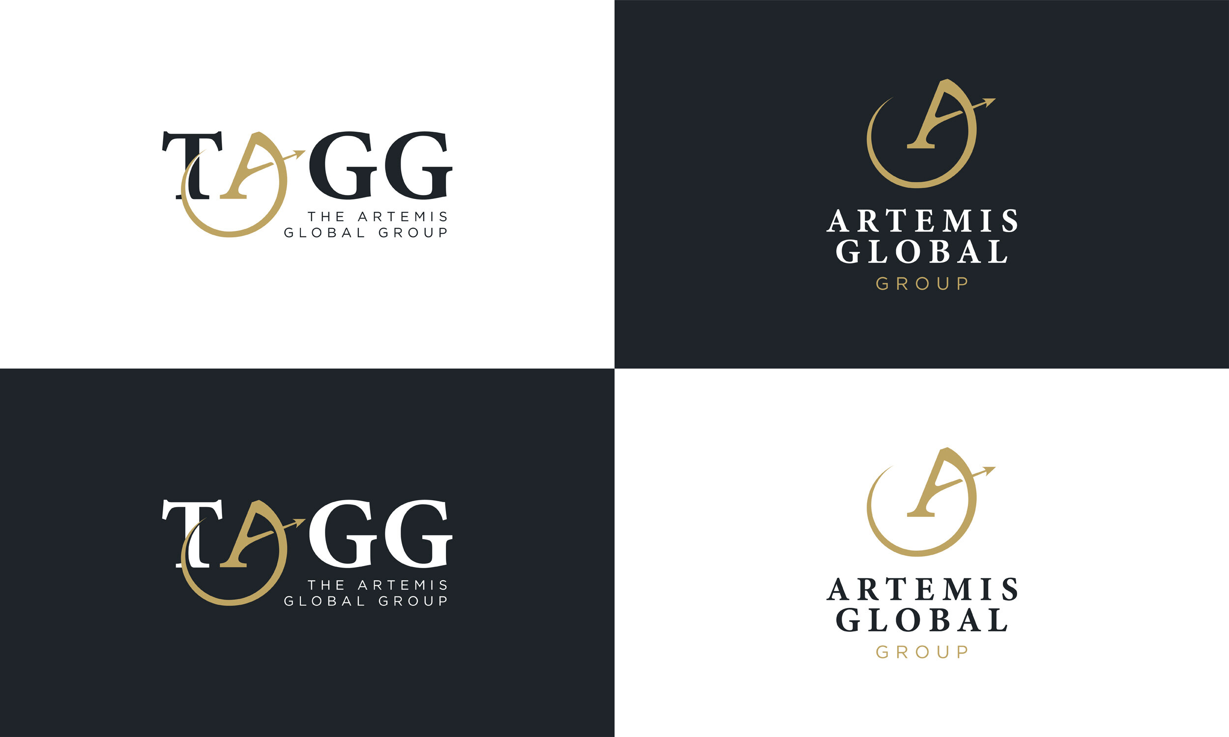
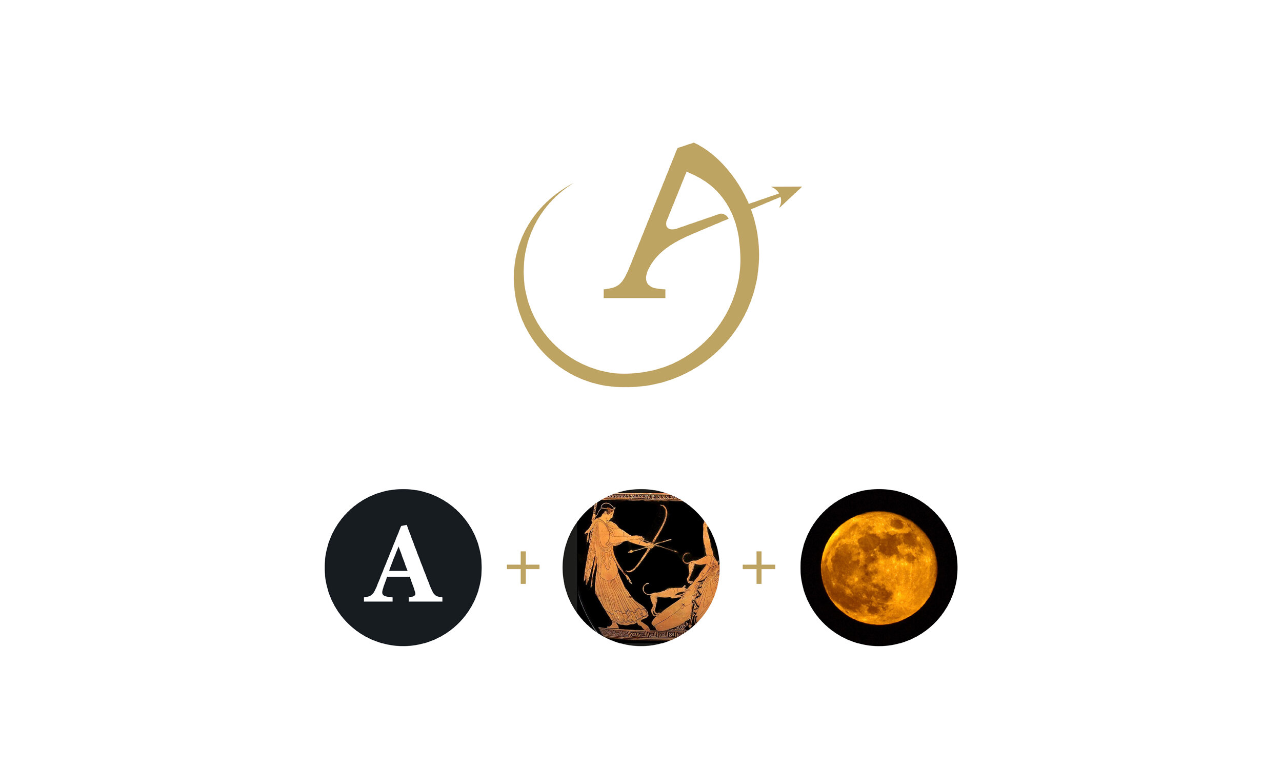
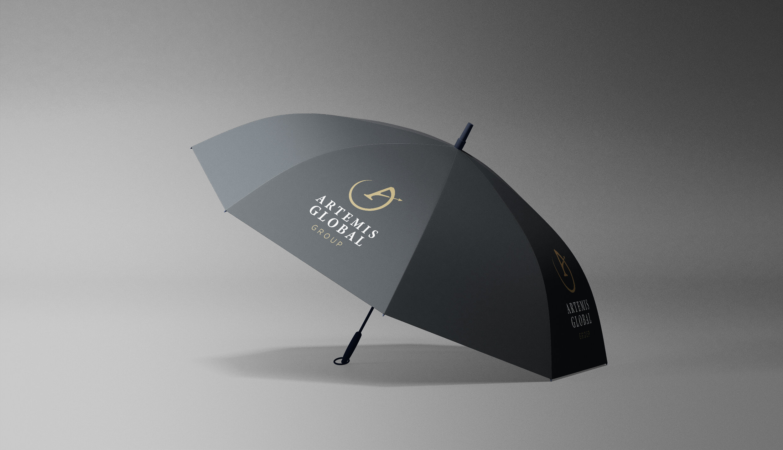
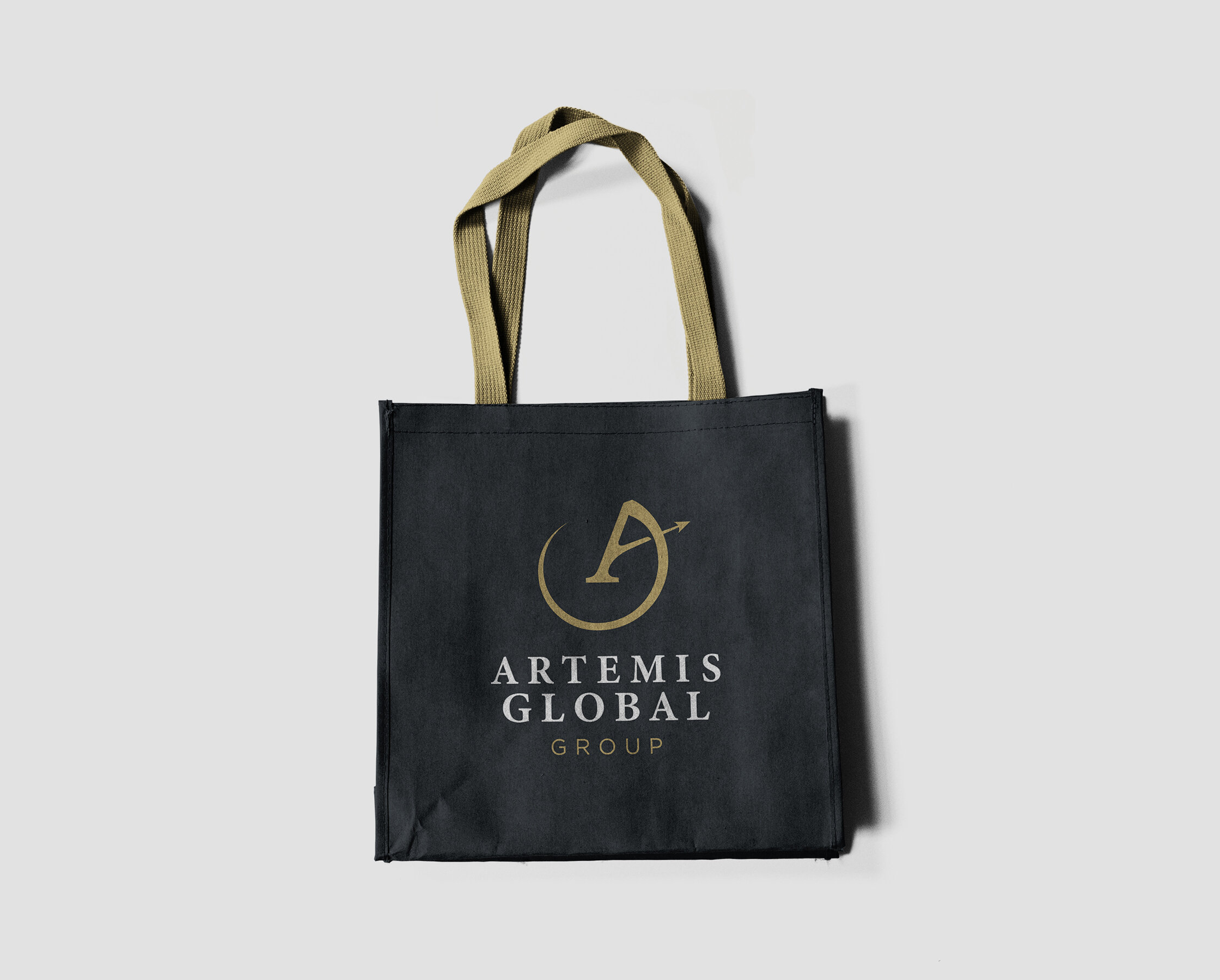
The logo combines key aspects of the Artemis myth — a letter A, combined with the moon and a hunting arrow to create a really impactful logomark.
We worked with Artemis to develop a rich palette of greys and golds to create the impression of corporate luxury, and chose a traditional serif font to infuse the idea of an expert, trusted consultancy.
While Artemis is a new firm, its brand identity now very much gives it an established, premium feel.


“Bourne and Bred were the creative catalyst in helping get our company off of the ground, and they played a pivotal role in our early successes. We could not have been more pleased with how they work and what they created for our brand.”
Roderick Keller, Artemis Group Co-Founder