
Share this:
Facebook
Twitter
LinkedIn
Tied Together Brand Identity
Brand identity | Packaging | Marketing materials
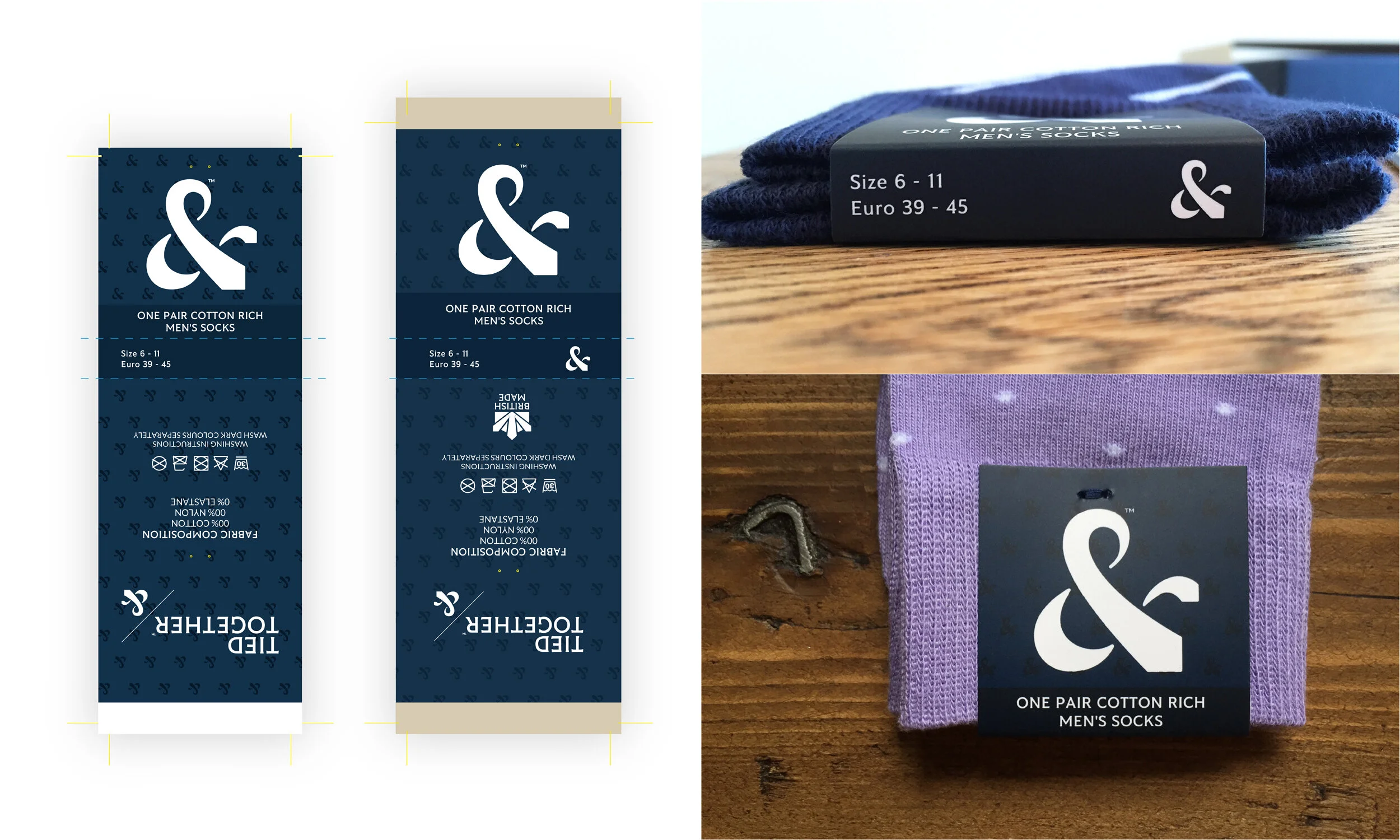
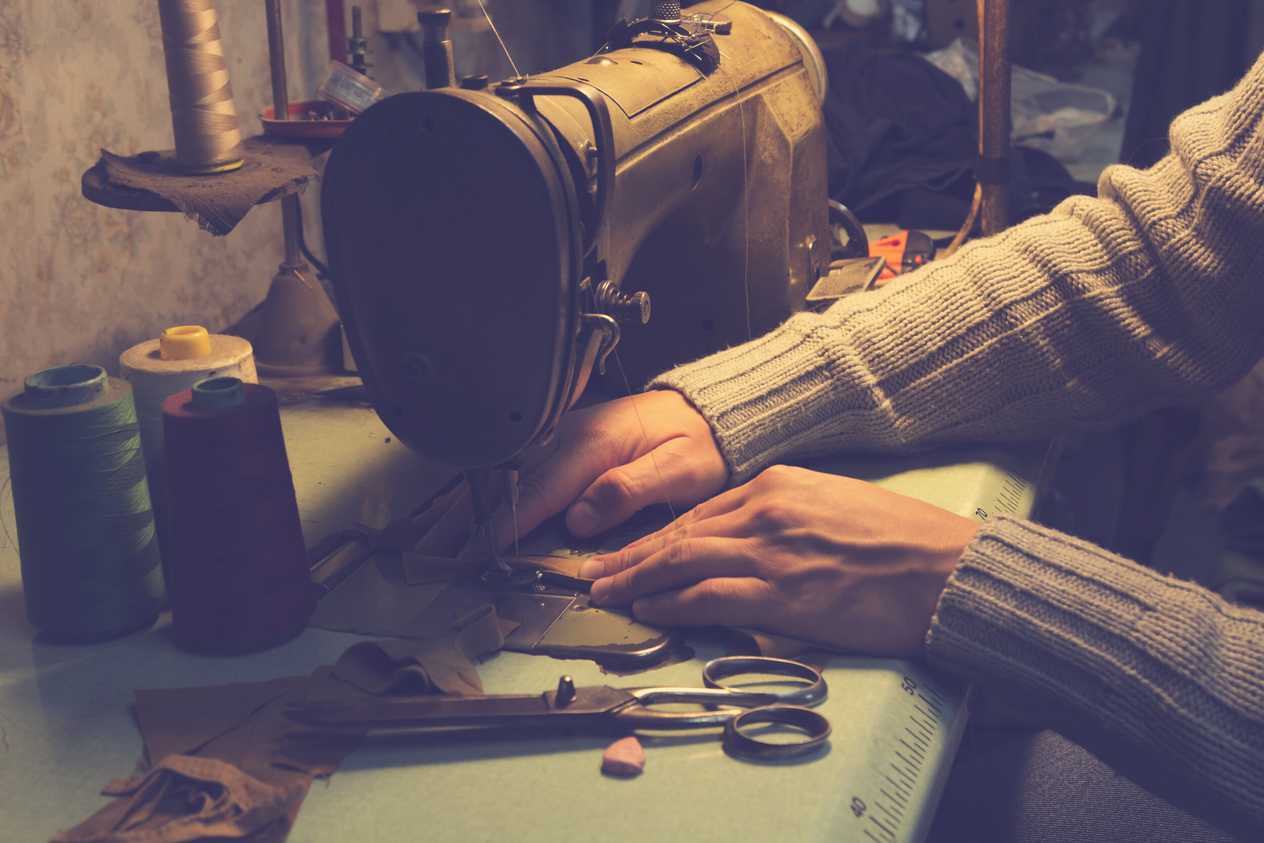
Tied Together are a luxury menswear accessories brand, providing matching sock, tie and pocket square gift sets to gentlemen across the world. Bourne and Bred were asked to help shape the brand from scratch and craft a brand identity that would give a sense of luxury, quality and British authenticity.


The brief
—
Tied Together was founded by a young, fashion-conscious entrepreneur who found a gap in the market for 100% matching ties, pocket handkerchiefs and socks. Tied Together’s gift sets soon found favour with people from the corporate world, wedding parties and even car dealerships.
The firm needed a smart brand identity that would appeal not only to its current market but would also have an aspirational quality to help draw in new customers.


The solution
—
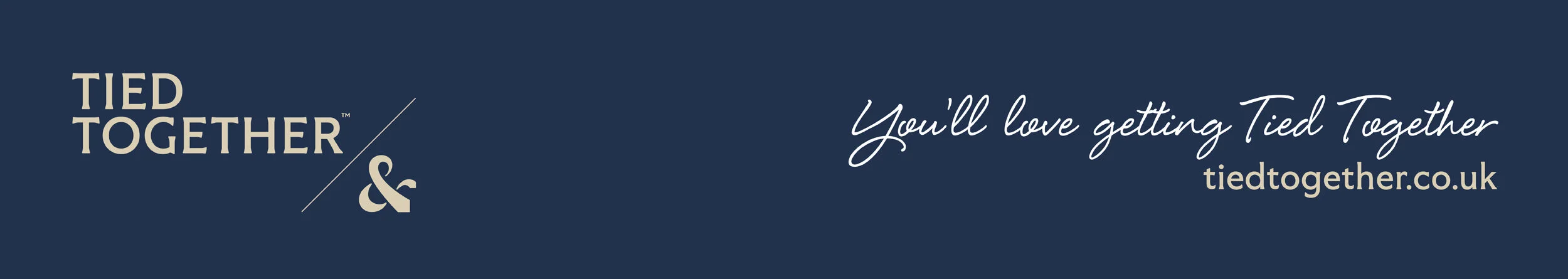
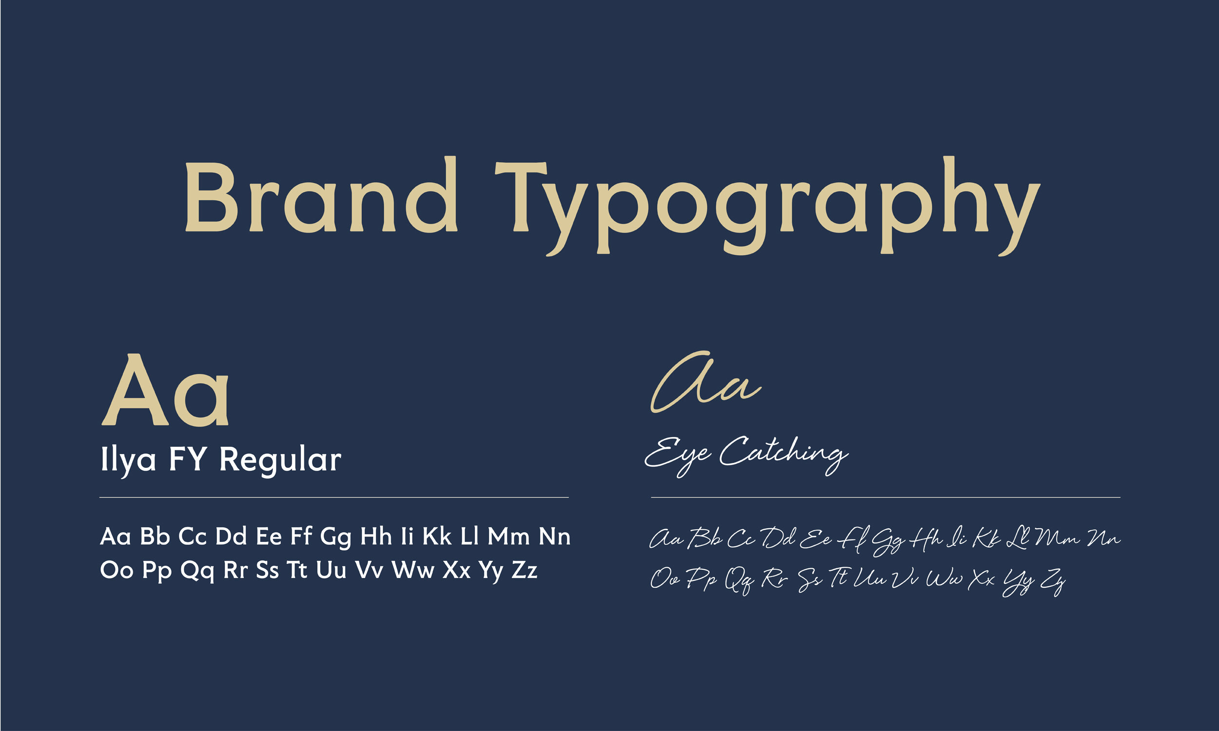
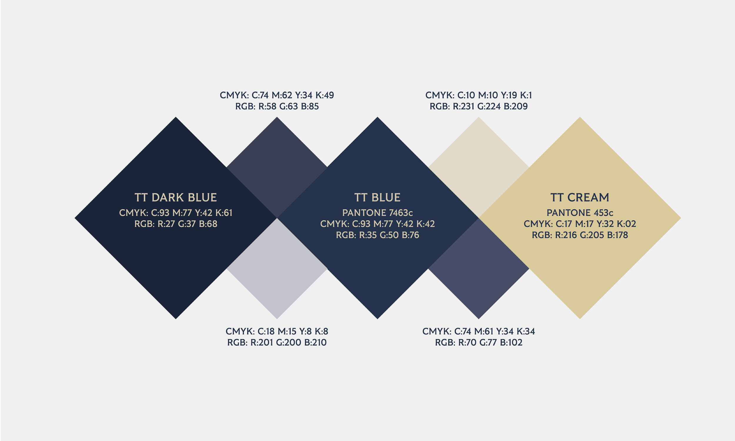
Our conversations with Tied Together helped us narrow down a colour scheme of royal blue and gold, with complementary shades of pale blue, grey and cream, all chosen to suggest luxury, high-end fashion.
The font we settled on had a prestigious look to it but with a slightly rounded form, to make sure it still felt personal.
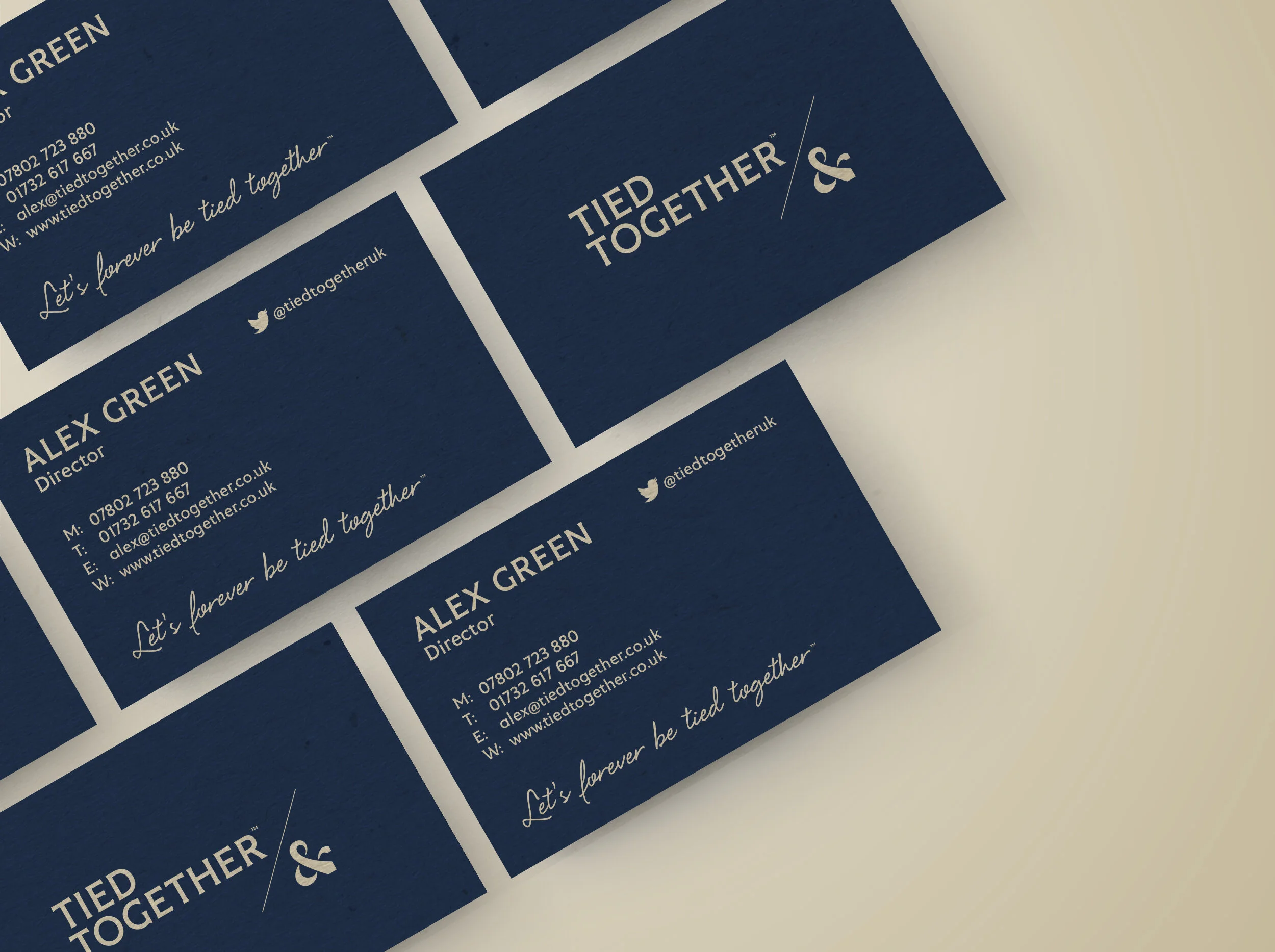
For the logo, we combined the form of tie and ampersand to create a really unique icon which appears across the company’s product range and marketing materials.
Tied Together asked us to work the new brand into their marketing materials, including a concertina-style brochure, exhibition stand, seasonal promotions, flyers, packaging and social media assets.


“Any work I ask of them is always completed in a timely fashion, with pleasing results. Ultimately, I don't think my business would be so successful without Bourne & Bred's design work.”
Alex Green, Tied Together Founder